Prototype Transition of Existing A&F Mobile/Desktop Websites to Responsive Design & Codebase

Nov - Dec 2014
HTML, CSS/Scss, JS/jQuery
Challenge
Evaluated existing mobile and desktop code and devised an efficient, mobile-first approach to merging the two bases into an easier-to-maintain unified design.
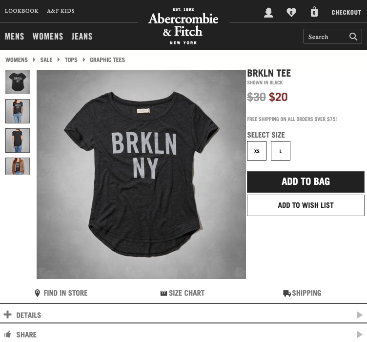
Created prototypes for major elements of the website, such as the header and product page. Special focus was placed on the header navigation, balancing important links with space available and dropping the hamburger menu as soon as possible.
Play video to see my responsive header design in actionLessons Learned
Prototyping from existing code bases was made easier by selecting the most complex view (desktop) and minimizing the screen until the layout broke. Next, observing the smallest screen for key points that would make sense to transition to more information - for example, getting rid of the hamburger icon as soon as main gender categories had space.
Because of the extensive CSS bases for each site, it helped most to break the CSS up starting with desktop CSS, and then identifying code changes for increasingly smaller breakpoints. However, I then flipped the code blocks, starting with the mobile and adding CSS as the viewport increased in size, so that the CSS had a mobile-first approach.